P
Positioning
How you are understood, remembered, and chosen.
Quadigy should feel editorial, exacting, and commercially awake. The system is dark-first, sharp-edged, logo-led, and built to carry the firm’s four-part method: Positioning, Credibility, Visibility, Demand.
The cube-like Q mark already carries the brand’s signal: constructed, dimensional, blunt, and memorable. Use it confidently, with generous clearspace and very few competing shapes.
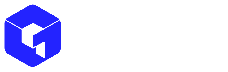
Use the white lockup on dark navy, black, image overlays, and high-contrast presentation covers.

Use the blue mark with black wordmark on white, paper, proposals, invoices, formal documents, and light web surfaces.
Use colored mark lockups when the artifact needs stronger brand energy. Keep to one accent family per page or section.
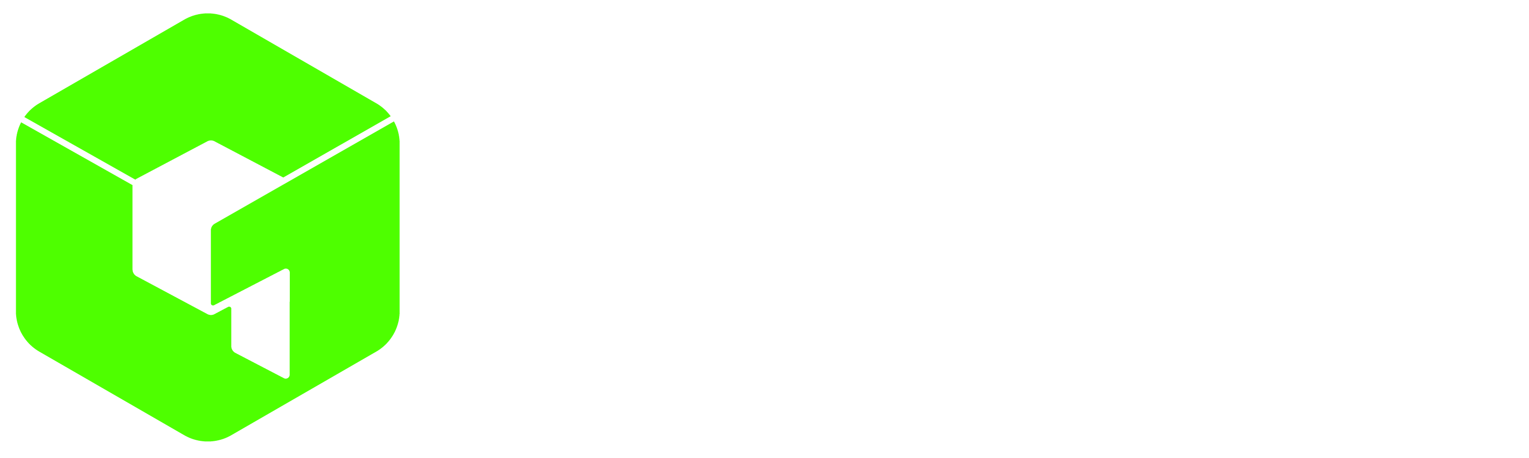
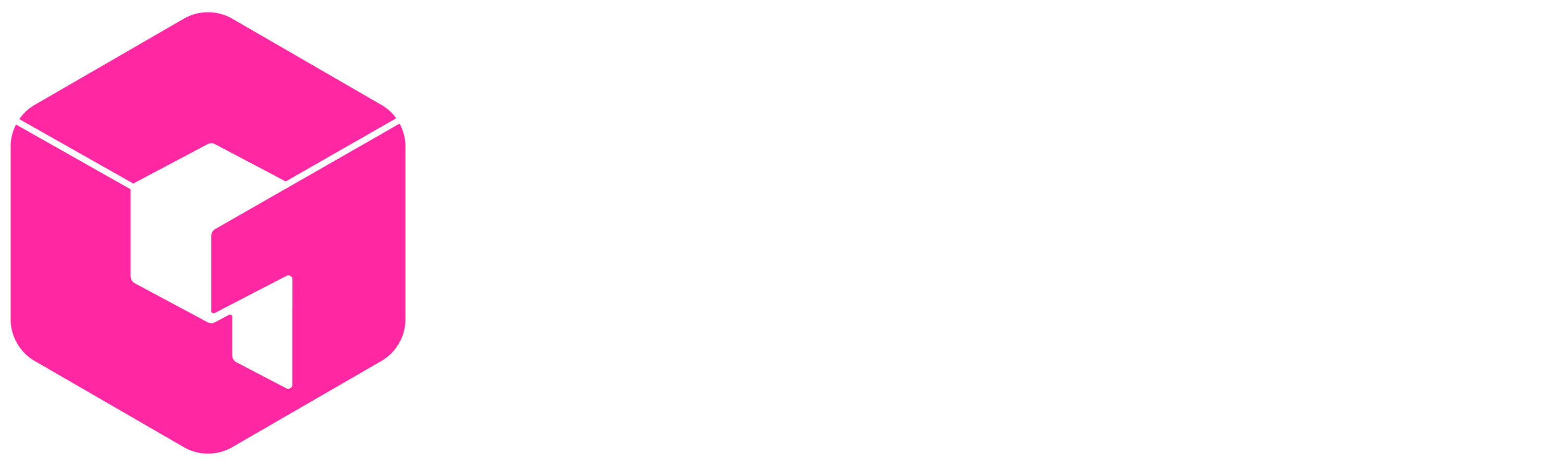
The colored wordmarks are allowed for compact placements, social crops, internal dividers, merch, and layouts where the full lockup would feel too heavy.


Clearspace wraps the complete logo unit: mark plus wordmark. The measuring module comes from the Q in the wordmark.
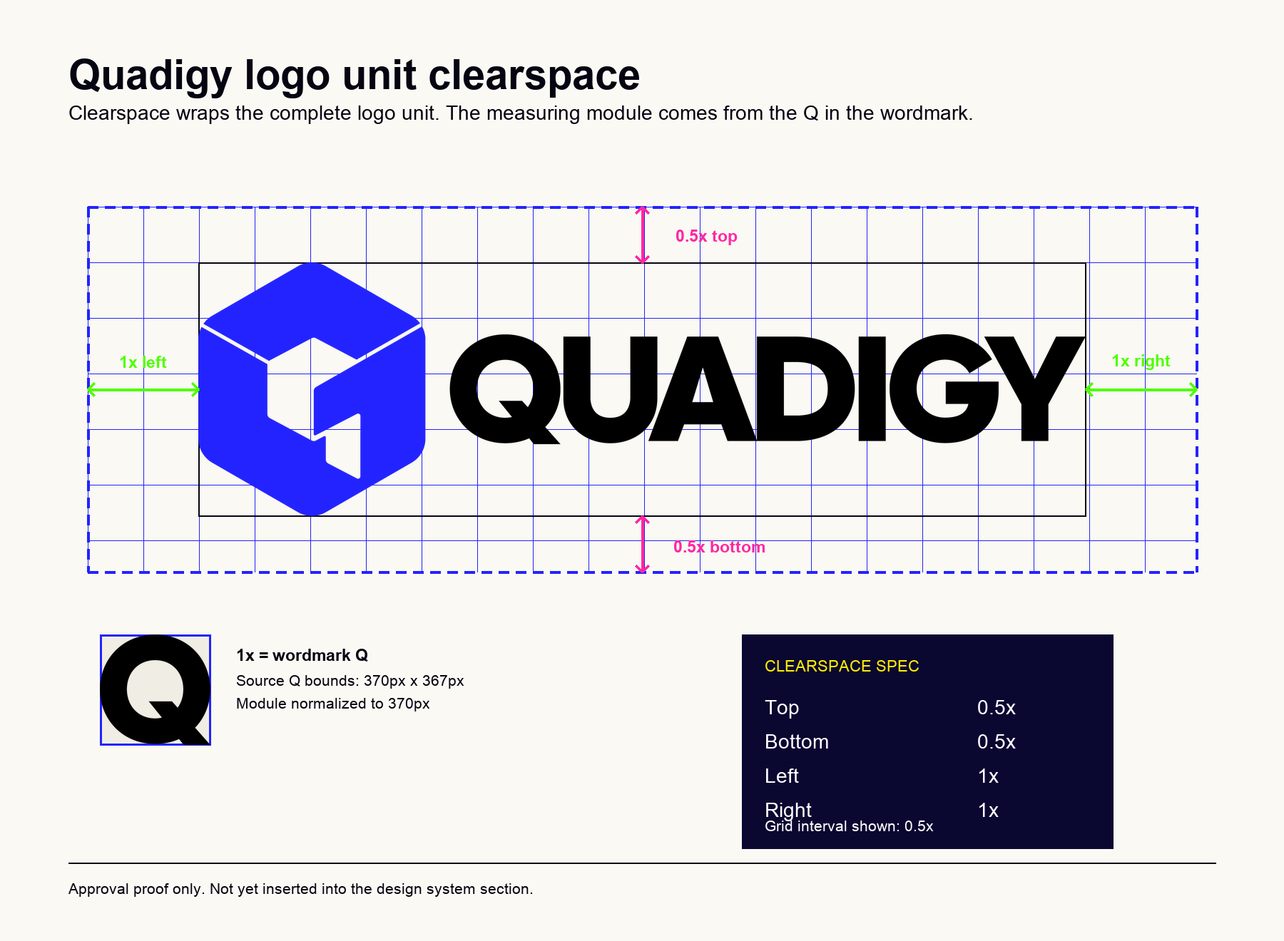
Use the mark only for square or tiny contexts. The wordmark should not be used where it will collapse, crop, or become unreadable.
The logo colors are exact: blue, green, pink, and yellow. The brand should be mostly navy, paper, white, and ink. The electric colors should behave like proof marks, practice tags, CTAs, and decisive highlights.
#FFEF00#FF28A2#2323FF#4EFF00Most pages should feel calm, serious, and spacious.
Pick the practice color that matches the message.
A CTA, a proof number, a divider, or a decisive highlight.
The type system gives Quadigy its editorial-business character. Avoid decorative type tricks. Make the hierarchy do the work.
Source Serif 4 / display / 500
Start with what is not working.
Grift / heading and body / 400-750
Positioning · Credibility · Visibility · Demand
JetBrains Mono / metadata / uppercase
Proof / 04 · Revenue, not impressions
Every sales artifact, diagnostic, case study, and campaign should be mappable to these four practices. They are the repeatable vocabulary that makes Quadigy easier to understand and easier to buy.
How you are understood, remembered, and chosen.
The trust layer that shortens sales cycles and raises perceived seriousness.
The infrastructure that helps buyers find you where they already look.
Attention converted into qualified pipeline with commercial discipline.
Cards, buttons, labels, forms, and navigation should be quiet enough for consulting work and distinctive enough to feel like Quadigy. Borders over shadows. Pill CTAs only where action is clear.
44px min-height · pill radius · accent fill · no icon unless functional
Use proof objects as compact evidence blocks: one label, one claim, one supporting sentence.
Quadigy’s copy should sound like people who have sat inside the business, not like an agency presenting moodboards. Short claims. Specific nouns. No inflated adjectives.
“Your marketing exists. The signal does not.”
“A clearer position changes pricing power, sales velocity, and who replies.”
Say “pipeline,” “proof,” “decision,” and “buyer.” Avoid “journey,” “delight,” and “best-in-class.”
Use the same structure everywhere: mono marker, strong claim, business proof, disciplined accent. The format can change; the rhythm should not.
Never let a page become a collection of feature cards. Every screen should move from diagnosis to decision.
A design system is only useful if teams can make consistent decisions without asking every time. These rules cover the areas that usually get missed in a first-pass brand system.
Use the full lockup only when the wordmark is legible. Switch to the mark-only asset for small square placements.
The mark is already distinctive. Avoid effects that make it feel less precise.
Quadigy layouts should feel structured, spacious, and business-first.
The electric colors are accents, not body-copy colors. Keep reading surfaces calm.
Favicons, app icons, LinkedIn profiles, and social avatars need the standalone mark, not a compressed wordmark.
Download logos from here when building decks, proposals, social profiles, and web pages. Use the full lockup for readable horizontal placements, the wordmark when space is narrow, and the mark-only square for favicons or platform avatars.
Use for headers, covers, decks, proposals, and partner pages where the complete identity has enough room.
Use for compact horizontal placements, social crops, merch, dividers, and layouts where the mark would feel too heavy.
Use for favicon, app icon, LinkedIn profile image, social avatar, and other square platform placements.
Use when briefing designers, vendors, agencies, and internal teams on logo spacing and brand rules.